
I was asked by our editor, Barbara Lynch, to discuss the "Golden Mean," a proportional function of designing a work of art. Balance, rhythm, and contrast, according to the textbooks on design, are also functions of design, and they all work together.
The Golden Mean is an historical theory proposed as a basis for satisfying proportion. It is more simply understood by a geometric picture rather than a mathematical ratio:
To divide line AB by the Golden Mean, first bisect the line AB at point C. At B, er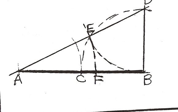 ect a perpendicular equal in length to AC. Complete the triangle ABO, and on the hypotenuse, AD, locate point E so that DE equals BD. Then locate point F on line AB so that AF equals AE according to the proportions of the Golden Mean. AF is larger than FB mathematically.
A simpler and non-mathematical means of satisfying proportion was one taught at Seattle Central Community College in the Advertising Art program. This is called "Unequal Intervals." It was taught using a two-dimensional plane. "The space at the top and the bottom of the page--whether it be text or pictureshould not be equal. Never cut your picture in half horizontally by making the horizon line dead center on the page; that makes two pictureS. This goes for vertical also."
Mondrian, the painter, used unequal intervals in his paintings. He used variety in both his dimensions of shapes (rectangles) and his color, even though his main focus was repetition of rectangles. This can apply to sculpture as well. The exception to unequal intervals is bilateral symmetry-a function of balance where the two sides are the same (mirror view image) on either side of an implied axis, i.e., the human body as seen from either the front or the back when the body is "flat" with arms extended equally and legs extended equally. Bilateral symmetry can be given variety by changing an angle or direction. Even a slight change can make a difference.
Contrast (or variation) should be considered here because it also involves proportion. "It can be used to clarify or modify form, to create mass and space and to suggest or focus attention." My critic teacher (in an Art Education program) in one project had the class use dark, light, and bright-the contrast being the bright. The same can be used proportionally in sculpture. One example is the use of big, little and middle; two of these can be geometric shapes and one a non-geometric shape, or the big and middle taking so much space the little becomes the contrast.
I have not enlarged upon balance or rhythm here because they could further be discussed with the elements of design, such as line, mass and value.
We sculptors use these functions of design as we work at an intuitive level. It is also important to be aware of them at a conscious level mainly when we are faced with a design problem. They are like writers' tools such as the dictionary.
Source used: Art: An Introduction. Dale G. Cleaver, 4th edition, Harcourt Brace Publishers, 1985